Role: UX Designer / Visual Designer
Team: Client (Fernando López Macari), Web Developer, Copywriter
Duration: 4 months
Deliverables: Logo design, brand guidelines, stationery collateral, social media assets, digital content, responsive website
Client: Fernando López Macari
Project Summary: I collaborated with Fernando López Macari, a financial leader, public speaker, and entrepreneur, following his appointment as President of the Instituto Mexicano de Ejecutivos de Finanzas. The project focused on defining a cohesive brand identity, strengthening his digital presence, and creating scalable assets across web, print, and social media platforms to amplify his public impact.
Visual identity aligned with UX principles: legibility, adaptability, and trust-building.
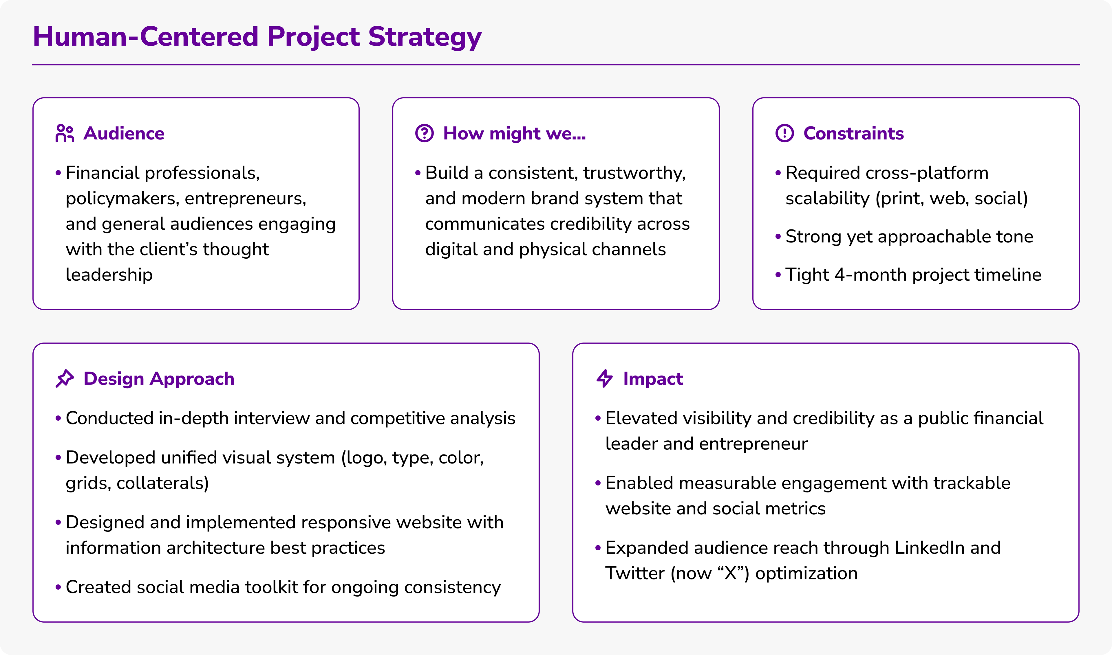
UX Strategy Snapshot: High-level overview that turned discovery insights into design principles guiding brand identity, information architecture, and digital execution.
Flexible horizontal logo system designed for adaptability across platforms and contexts.
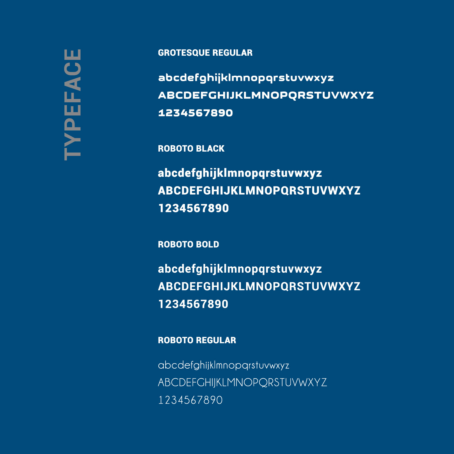
Typeface system ensuring clarity, accessibility, and consistency across print and digital touchpoints.

Geometric symbol distilled from the logotype, designed for flexible use in secondary applications.
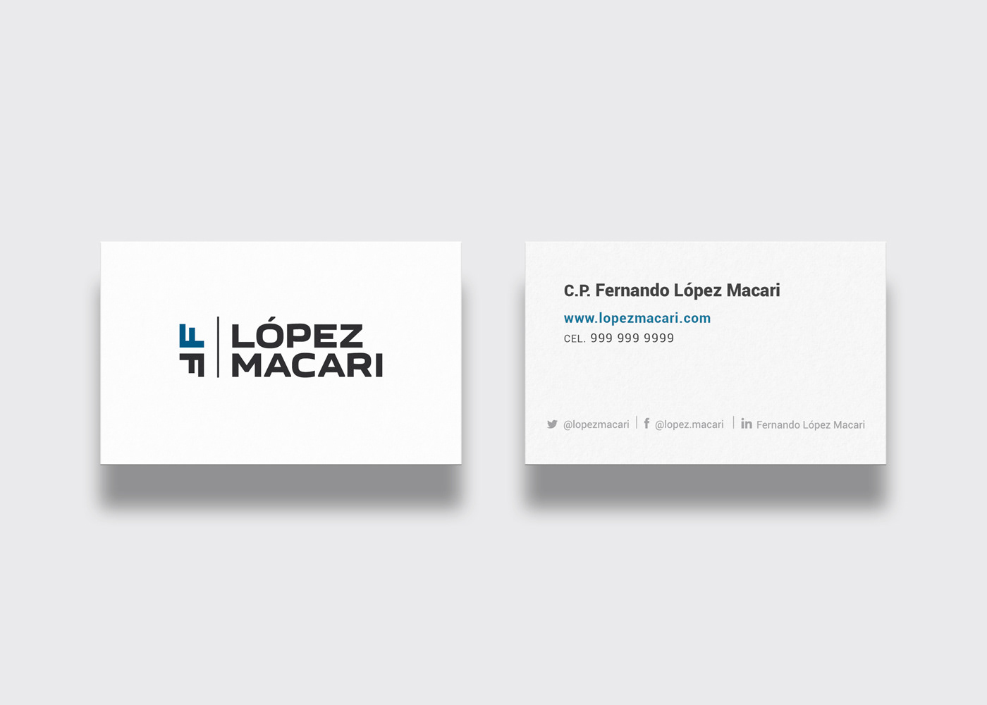
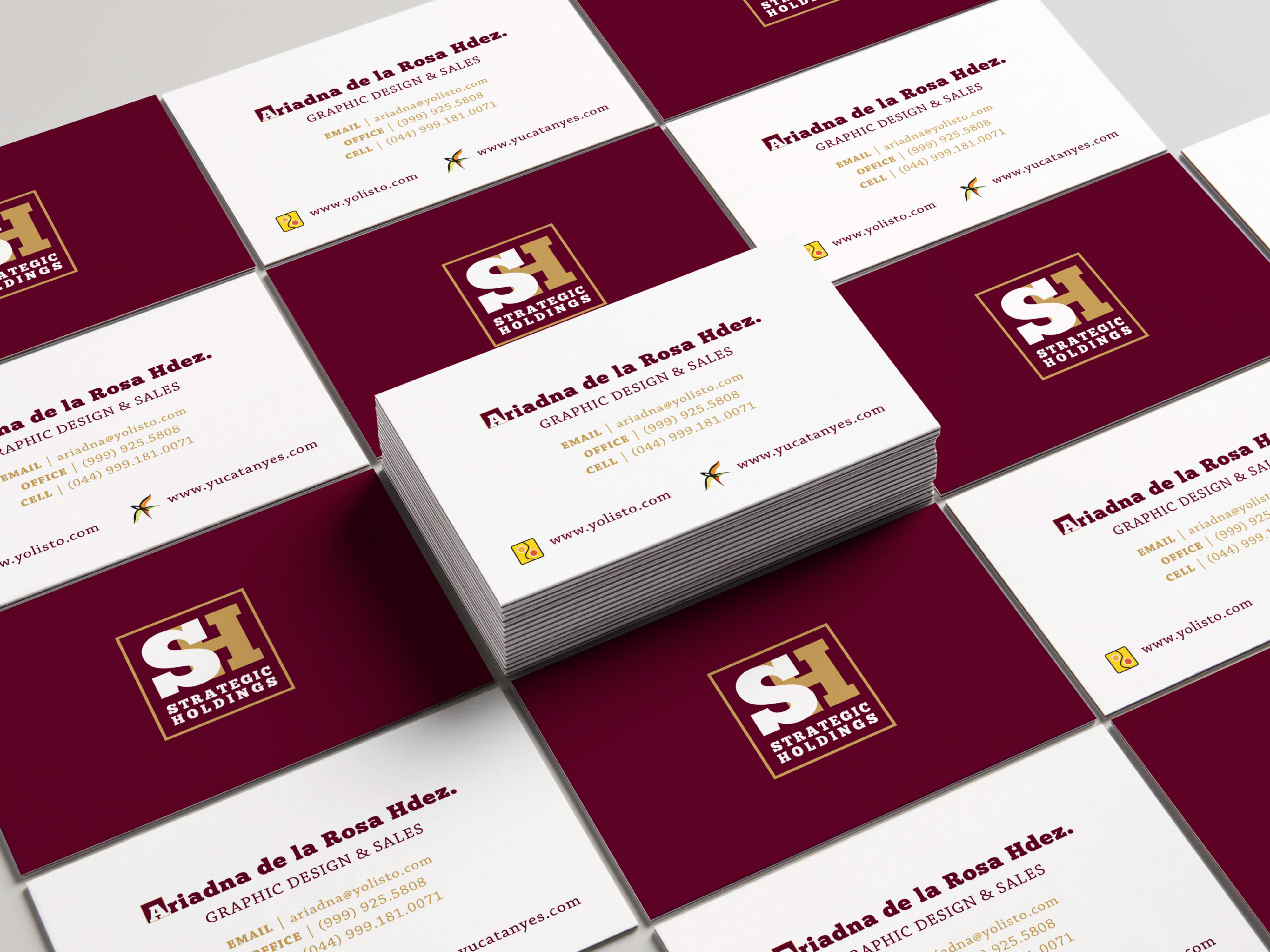
Business card: Front and back card layout balancing brand recognition with functional clarity.
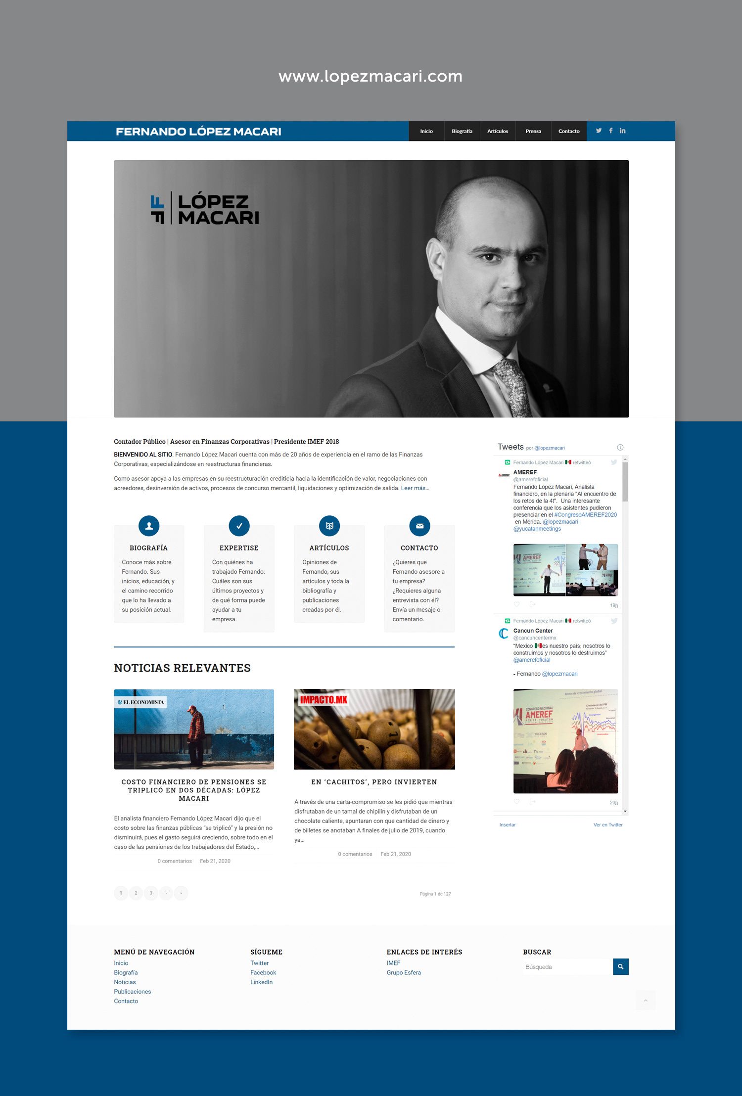
Fernando López Macari: Responsive website designed to showcase the client’s expertise and credibility as a financial leader. Developed with information architecture best practices to ensure clarity, accessibility, and engagement across devices.
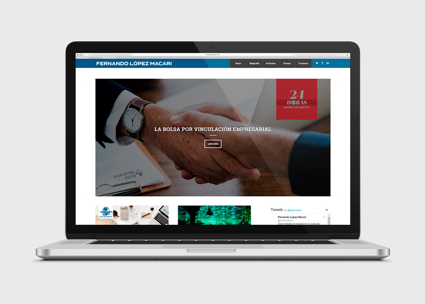
Hero section designed for immediate engagement, featuring clear value messaging and pathways to deeper content.
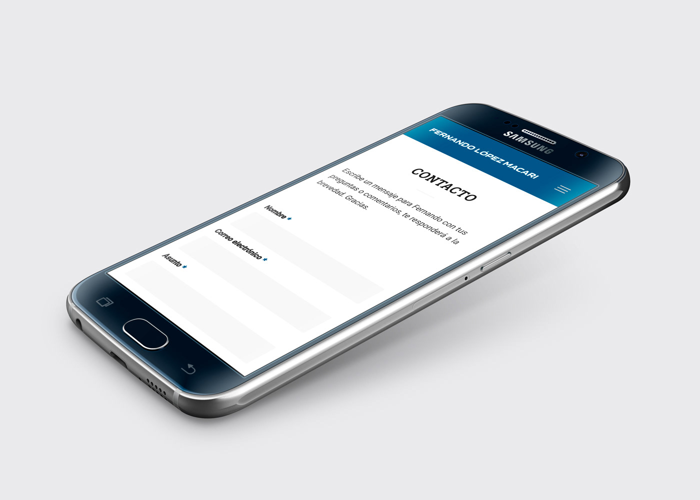
Responsive contact form streamlined for quick interactions, making it simple to reach this financial leader on the go.
Reflections & Next Steps
This project showed me how brand identity and UX systems thinking intersect. Designing for a high-visibility public figure meant balancing authority with approachability while ensuring consistency across print, digital, and social platforms.
It also delivered measurable value. The identity improved visibility across LinkedIn and Twitter, while the responsive website became a credible destination for press and public audiences. My support extended into social media campaigns, which made asset production faster and more consistent.
These outcomes also highlighted lessons that shaped how I approach future projects:
A) Consistency across channels was critical. Developing logo variants, typography, and color systems taught me to think about design as an ecosystem, a mindset I now apply to enterprise design systems.
B) Information architecture principles surfaced early. I used information architecture to structure navigation and content hierarchies, preparing me for more complex system mapping in large-scale product environments.
C) Metrics shaped the conversation. Website and social tracking linked design to measurable outcomes, shifting my perspective from visual appeal to business impact.
This experience sparked my shift from visual design to UX. It showed me that strong visuals alone were not enough, and that lasting impact requires research, structure, and measurable outcomes. It also motivated me to pursue my Nielsen Norman UX certification, laying the foundation for deeper training and my product design career.